Most people who have been printing their artwork or photographs have at some point, usually when they first began to have images printed, run into the issue in which some colors appear different in print compared to what they saw when they viewed the image file on their computer. Soft proofing is a way to help minimize these differences beforehand because it gives you an accurate representation on your screen before you even print.
This process takes into consideration the whiteness of the paper and how in-gamut (within the color range of a printer’s capability) these tones are. Programs like Lightroom and Photoshop, which happen to be the two most used programs for soft proofing even provide you gamut warnings that show you if certain tones in your soft proof preview may run into limitations. In other words, the printer might or might not be able to achieve those tones. There are plenty of tutorials on YouTube on how to soft-proof and many of our customers do utilize soft proofing but it is something you cannot do halfway. It’s an all-or-nothing process otherwise your example preview may not be accurate. Below are three common mistakes we see when people soft-proof.
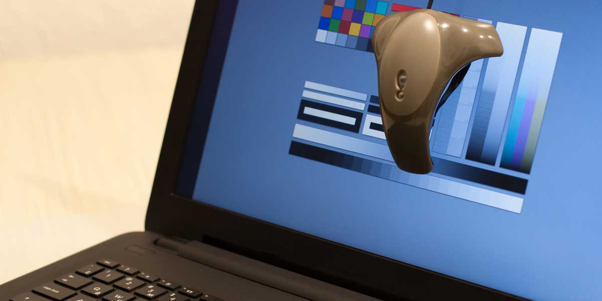
Mistake # 1: Not properly calibrating your monitor
I want to start off by stating DO NOT use the calibration print we offer as a way to calibrate your monitor if you plan to soft-proof. The calibration print you can get from us or from other color labs is good to give you a general sense of how tones print in comparison to your computer screen but is not accurate enough to accurately soft proof. Only a hardware device that can calibrate your monitor is going to achieve the accuracy needed.
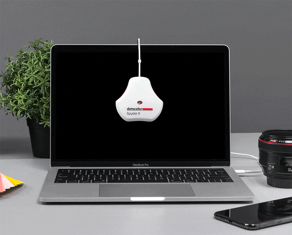
The SpyderX is a good tool for monitor calibration and runs about $160. It has extensive color calibration options, as well as functions for matching and tuning multiple displays. The colorimeter incorporates an ambient light sensor to measure prevailing light conditions and to automatically re-calibrate your monitor and maintain consistent results. Additionally, with SpyderProof functionality, you are provided with a before-and-after evaluation of your display, which allows you to see the difference using your own images.
Mistake # 2: Over-estimating the capability of low-end computer monitors/displays
Color labs will usually invest in very expensive displays that can achieve highly accurate renderings when viewing a soft proof. I don’t want you to feel that you are cutting corners if you do not have a high-end monitor or using something like a laptop but I know from experience when I use a lower-end monitor to soft proof that once in a while it leaves me wondering if perhaps soft proofing was not as accurate as it should be. In this respect, Adobe Lightroom has one-upped its cousin Photoshop or at least for now. Both programs offer gamut warning tools to show you if colors and tones are outside of the printer’s capability but Lightroom also has a monitor gamut warning option which helps to compensate by indicating if there are colors outside your computer screen capabilities. Because of this alone, I think that Lightroom offers a superior soft-proofing method.
Mistake # 3: Embedding ICC Profiles
Embedding the media profile is perhaps the biggest mistake. In Photoshop (or Lightroom) after you make your color adjustments in Soft Proof mode, you will want to save your image or at least a copy of the image you want to be printed. Make sure that when you save the image you DO NOT embed the media profile you used for soft proofing. This media profile is merely used to tell you how your image is going to look when it is printed so you can make appropriate adjustments. Instead, save your image as an sRGB image file. This way when the printing software prints the image it prints it with the adjustments made to look like it does on your screen. Embedding the profile takes it out of one of these popular RGB formats which the printer expects and therefore leads to unpredictable results.
Adobe has a great video on soft proofing in Adobe Photoshop CC. It is slightly dated but still relevant. I would suggest checking it out below:
The only exception I think I have with this video is the suggestion to use a colorimetric rendering intent. Make sure if you print with us to select Perceptual so that you are more closely in line with what our printers do.
James Theopistos
James Theopistos is the founder of FinerWorks, a print fulfillment company that has been in business for over 20 years. FinerWorks works with a large number of artists and photographers annually, and James has been noted for his understanding of the craft of printing and the needs of his customers. He has also been a presenter on topics such as strategies for becoming successful in business as an artist.
3 Replies to “3 Common Mistakes with Soft Proofing”
I am still confused about mistake #3, specifically in regard to the file that I need to send to you after soft proofing. After the soft proof, if I export the proof file, it is saved as an srgb with a number after it. Does that mean that the media profile is embedded? If so, how do I export it so it includes my soft proofing changes, but does not embed the media profiles? I am new to LrC, so please be patient. Thank you.
I believe the number you are referring to at the end has something to do with the version but it is not something to worry too much about. Any changes you made while in soft proof mode will alter the file just like it normally would. The only difference is you are viewing it as it would look printed while you are making those changes.
I see no difference between original image when Soft Proof selected. No change at all. This started after calibrating my monitor . I used Color Checker Display Plus

I am still confused about mistake #3, specifically in regard to the file that I need to send to you after soft proofing. After the soft proof, if I export the proof file, it is saved as an srgb with a number after it. Does that mean that the media profile is embedded? If so, how do I export it so it includes my soft proofing changes, but does not embed the media profiles? I am new to LrC, so please be patient. Thank you.
I believe the number you are referring to at the end has something to do with the version but it is not something to worry too much about. Any changes you made while in soft proof mode will alter the file just like it normally would. The only difference is you are viewing it as it would look printed while you are making those changes.
I see no difference between original image when Soft Proof selected. No change at all.
This started after calibrating my monitor . I used Color Checker Display Plus